Business case
In the Capital One app users are able to deposit their by taking a picture of their paper check. We found users were experiencing a high number of errors which caused user to stop using the service which caused a decrease in deposits.
Problem
Some Capital One branches were closing down which hindered people from depositing checks. When users would try to scan their checks there was high percentage chance that there would be an error and they would not use that service again.
How can we create a solution that will decrease error rates and educate our customers about the remote check deposits enough that will increase usease rates and decrease fraud activity?
Constraints
One of the biggest constraints was that I did not have much control over the actual check scan process because the technology was from a 3rd party. I also what not able to change much of the functionality of the process in the app due do the components were a part of bigger ecosystem of the capital one app. This meant we had to be creative with tight limits.
Project Sope
Decrease the amount of errors in the mobile check deposit process
Find out what other factors caused errors in the system.
Design Objective
Improve the mobile check deposit experience for our customers
Results
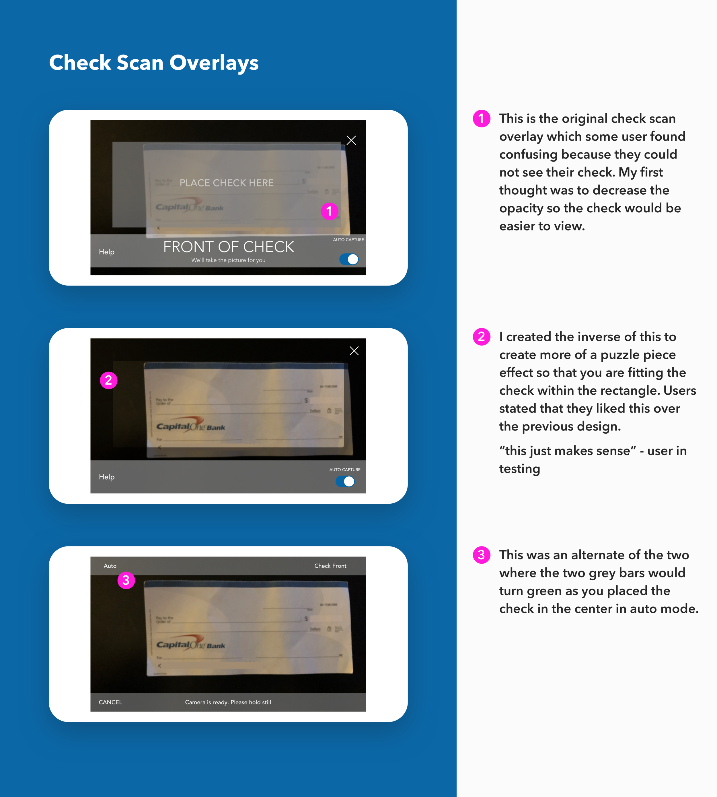
I made a change to the UI by reversing the current design and created consistent error messages the users could understand.
Change in the number input field that make it easier to catch the decimal in your amount.
I along with my project manager we designed the current mobile check deposit experience which decreased check fail scan rates by 15% and increasing deposits by 30%.
My Role
UX Designer | User Researcher | Visual Designer
Methodologies
User Interviews, User Journeys, User Stories, Sketching, Persona development, Wireframes, Competitive analysis, Prototyping and User Testing.
Tools
Pencil and paper, Sketch, Marvel, User Labs
Research/Analysis
We conducted multiple rounds of research in our labs at Capital One and in person interview in some Capital One branches. We choose branches that gained a spike in traffic due to a branch that was recently closed near them because our research showed that most people came into the branch to deposit check
Personas
What the user said
“Sometimes it give me an error and I don’t know what to .”
“I like the mobile when it works .”
“I’m sure that I get my money faster when I deposit it in the bank. Honestly I just think it’s safer to deposit my check at the bank.”
Key Findings
When using using the mobile deposit function users don’t understand what some of the errors mean.
Users believe they receive their money faster from depositing their money in the bank rather than using the mobile deposit function.
If something goes wrong with their deposit when they are using their phone they are most likely not willing to use the function again.
Some users do not believe the mobile check deposit function is secure
User Flow
This is the user flow of the mobile deposit or (RDC) remote check deposit. It was beneficial to map this process to see where our users would cause an error or where they might have gotten confused in the process.
Sketches
I started with sketching new ideas for the UI to see if this might help to create an easy experience for the user. Quickly I found that there wasn’t much we could change due to development constraints with the 3rd party software that was used to scan checks. I event designed a vertical UI so that users would not have to rotate the phone when they would take a picture of the check.
After user testing I thought of adding an onboarding component to the system to inform new users the next steps and how mobile deposits worked. I wanted to call out the security aspect because this was something that users wanted to know about just to feel more comfortable.
We found that most people would skip this step or just not believe what we said here.
Competitive Analysis
In developing a solution, my process was to explore and see if there was already a solution to the problem we faced. I checked the process of popular banks such as Wells Fargo, Bank Of America, Simple, USAA and Navy Federal. While I found that there were some differences in the layout and user experience, it was very difficult to know what 3rd party application the bank used.
From previous user feedback and combined some elements to test but eventually we would not be able to use because of constarats of our overall design system.
Hi-Fidelity Mockups
While I was not able to change much from the original design due to development constraints I provided some exploration mockups I designed with the user in mind.
I was about to make changes to the error messages so that they made sense and were presented clear for the user.


