

BUSINESS CASE
Venmo is an app that allows users to send (peer-to-peer) payments to other users for free. It’s popular especially among twenty-somethings to pay friends back, split bills, and more.
Challenge
Venmo would like to introduce a way for users to send money via their app to causes they care about whether that be a nonprofit that combats hunger or a unique Kickstarter campaign.
RESULTS
Created an effective extension for Venmo that allow you to donate to causes as easily as it is to pay a friend.
MY ROLE
UX Lead | User Researcher | Interaction Designer | Visual Designer
METHODOLOGIES
User Interviews, User Journeys, User Stories, Sketching, Persona development, Wireframes, Competitive analysis, Prototyping and User Testing.
Interviews & Surveys
Created a survey to learn about people's donations habits, sent a follow-up survey going in depth on user donation habits and pain points. Affinity maps were then based on user surveys and Interviews.
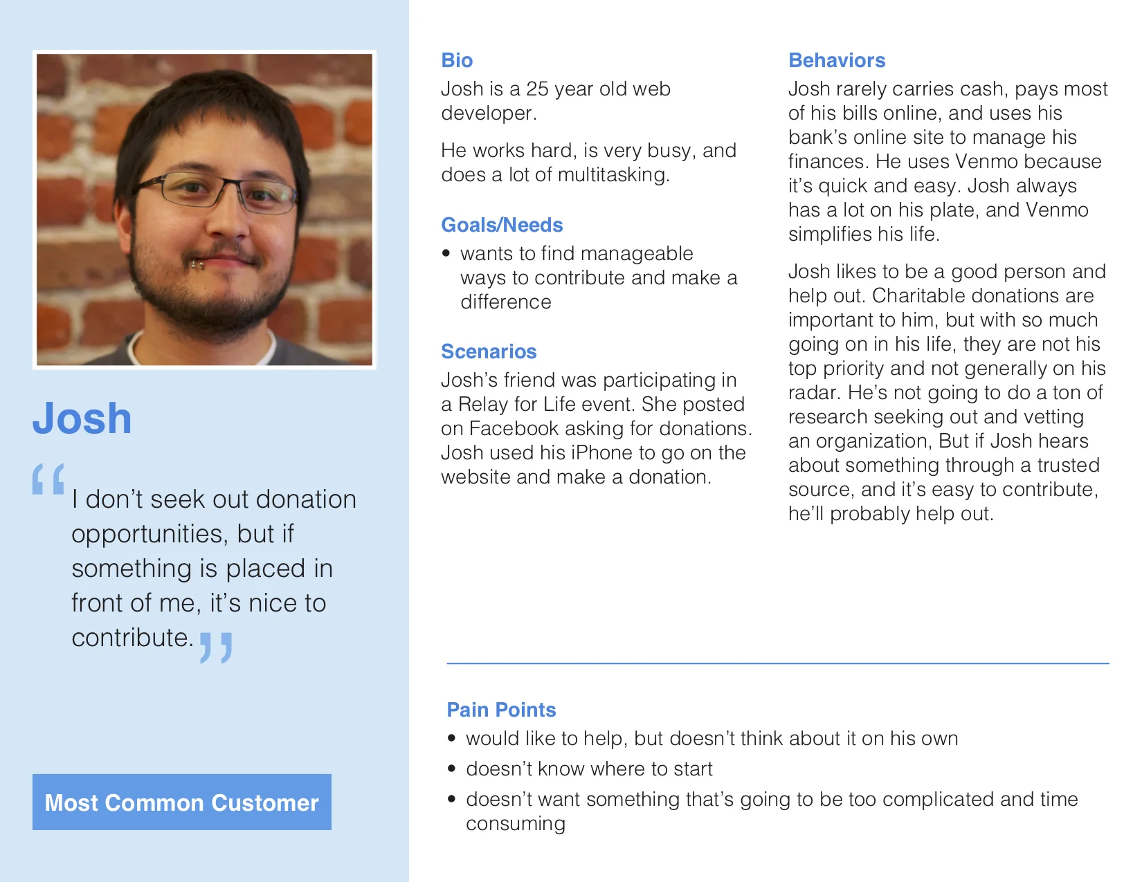
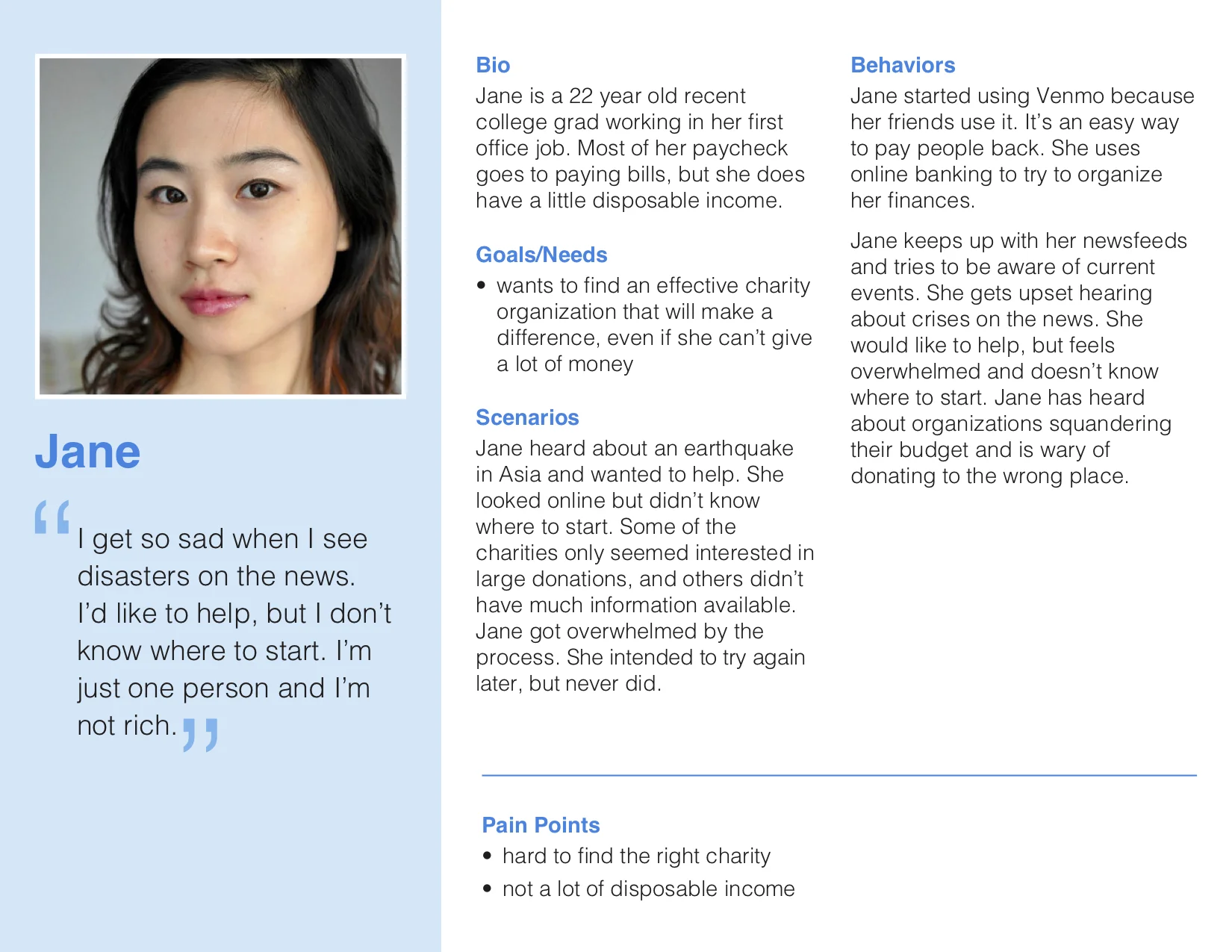
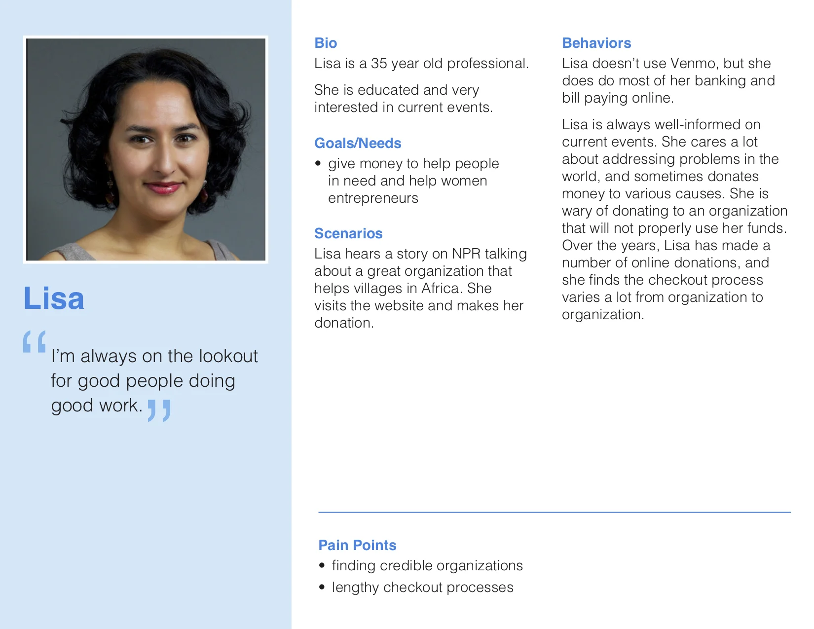
Personas
We developed persona based on the patterns from our affinity map and user interviews to determine their specific pain points in more detail.
Insights


Competitive Analysis
We found that our competitive advantage was the amount of clicks it would take to donate to a cause
Other applications take you out of the application to donate while we keep you in one location
When donating online we found that you have to enter too much data just to make a donation
Card Sorting
I wanted to see how our users would categorize the information presented to them. The results varied based on preference so we let them prioritize what type of campaigns they would see in the application.
Sketching
My goal was to keep the process a simple and streamlined as possible so I decided to follow Venmo's process. I sketched some the screens for the user flow to visualize the personas needs based on our research.

My first sketch for the application. Venmo Give is similar to an add with a slider to view more campaigns

This sketch I added a button to view more campaigns and added an icon to a user status to show that they have donated.

HI-FIDELITY DESIGNS


Usability Testing
We conducted usability tests through the development of our prototypes and integrated the following changes based on the feedback we received:
Placement of the VenmoGive banner and icon placement on the homepage. I made the “VenmoGive” bar larger than the other status bars but changed it to look less like an advertisement.
Addition of the Interest Selection. This decision was made from the feedback of the card sorting because everyone had different interested and I decided that it would be more user friendly for user to curate their causes of their choosing.
Addition of the on boarding page. From the feedback from user testing I wanted to make sure the user understood what they were doing and that is was important for them to take action.
Gallery style of the Donation page. After the user testing I decided to create a view where the use could effective view more campaigns at once. The user also has the ability to endless scroll down this Donation page.
Ability to quickly donate preset amounts. From user testing we found that the user would be more inclined to select from a preset amount rather than to type in an amount.
FUTURE CONSIDERATION
I see myself pitching this service to Venmo as a way to grow their users and leverage their platform to support big causes that create a great positive impact around the globe.